For a new project, I recently wanted to make a small multiples plot of McCrary density tests (which the rddensity package does a great job of out of the box for a single test) across groups and years using the rdplotdensity function. In a situation where I create/give ggplot the data myself, I can easily use faceting tricks to make nice small multiples plots, but I quickly ran into limitations with the objects that rdplotdensity outputs. I couldn’t find much online about how to extract the underlying plot data from rdplotdensity objects. This post shows my workflow for doing that. To demonstrate, I’m going to start by creating fake regression discontinuity data.
But first, we’ll use:
rddensityfor the density testtidyversefor data wranglingpatchworkfor combining plots
    library("rddensity")
    library("tidyverse")
    library("patchwork")

    set.seed(09162025)
I’ll create a simple uneven panel across two groups (A/B) and three years (2000–2002). Each cell gets its own random sample size, and we draw a uniform running variable from [-2, 2].
# Groups and years
groups <- c("Group A", "Group B")
years  <- 2000:2002

# Unique combinations
group_year_combo <- expand.grid(group = groups,
                                year  = years) |>
  arrange(group)

# Fake dataframe with uneven panel
df <- group_year_combo[rep(1:nrow(group_year_combo),
                           times = round(rnorm(n = nrow(group_year_combo),
                                               mean = 1000, sd = 50))), ]

table(df$group, df$year)

# Create running variable
df$runningvar <- runif(nrow(df), -2, 2)
It’s easy to loop over groups/years, run the McCrary test, and generate plots with rdplotdensity.
# Run density checks
densitycheck <- lapply(1:nrow(group_year_combo), function(i)
  rddensity(
    dplyr::filter(df,
                  group == group_year_combo$group[i],
                  year  == group_year_combo$year[i])$runningvar,
    c    = 0,
    bino = FALSE)
)

# Generate plots
densitycheck_plots <- lapply(1:nrow(group_year_combo), function(i)
  rdplotdensity(
    rdd = densitycheck[[i]],
    X   = dplyr::filter(df,
                        group == group_year_combo$group[i],
                        year  == group_year_combo$year[i])$runningvar,
    xlabel = "Running variable",
    ylabel = "Density"
  )$Estplot +
    ggtitle(paste0(group_year_combo$group[i], "\n",
                   "Year ", group_year_combo$year[i]))
)
Our first try for the plot is with patchwork:
# Combine plots
wrap_plots(densitycheck_plots, ncol = 3, axes = "collect") +
  plot_annotation(title = "McCrary Density Test by Group × Year")
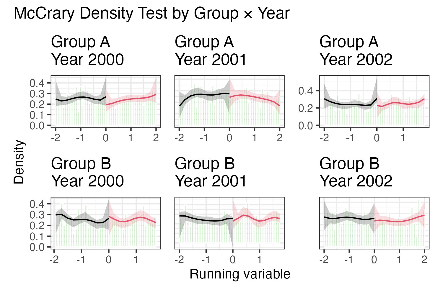
This works… but isn’t ideal. Axes aren’t fixed across panels, labels aren’t arranged as rows/columns, etc. There are some workarounds for these, (e.g., pre-constructing the axes, labels) but overall this feels like a hacky substitute for faceting.
What worked best for me was to extract the data from the rdplotdensity ggplot object. Here’s a helper function which grabs the relevant layers (in the tidyselect::anyof call):
extract_df <- function(plot_obj) {
  dplyr::bind_rows(
    lapply(
      ggplot_build(plot_obj)$data,
      \(x) dplyr::mutate(
        x,
        dplyr::across(
          tidyselect::any_of(c("colour","fill","alpha",
                               "linetype","linewidth",
                               "size","shape")),
          as.character
        )
      )
    ),
    .id = "layer"
  )
}
Apply this to all our density plots:
densitycheck_plots_data <- lapply(densitycheck_plots, extract_df)

names(densitycheck_plots_data) <-
  paste0(group_year_combo$group, "_", group_year_combo$year)

densitycheck_plots_data <- bind_rows(densitycheck_plots_data,
                                     .id = "plot_id") |>
  separate(plot_id, into = c("group", "year"), sep = "_")
Through looking at the objects by digging around gplot_build(plot)$data), I learned that each layer corresponds to a geom inside what is created by rdplotdensity. We can relabel them for clarity:
densitycheck_plots_data <- densitycheck_plots_data |>
  mutate(layer = case_when(
    layer == "1" ~ "geom_col",
    layer == "2" ~ "geom_ribbon_below",
    layer == "3" ~ "geom_line_below",
    layer == "4" ~ "geom_ribbon_above",
    layer == "5" ~ "geom_line_above"
  ))
Now that we have the data, we can rebuild the density plot with full control.
ggplot() +
  # First layer, the histogram
  geom_col(data = filter(densitycheck_plots_data, layer == "geom_col"),
           aes(x, y),
           alpha = 0.2) +
  # Second layer, ribbon corresponding to below the cutoff
  geom_ribbon(data = filter(densitycheck_plots_data, layer == "geom_ribbon_below"),
              aes(x = x, ymin = ymin, ymax = ymax),
              fill = "#00639e", alpha = 0.2) +
  # Third layer, line corresponding to below the cutoff
  geom_line(data = filter(densitycheck_plots_data, layer == "geom_line_below"),
            aes(x, y), color = "#00639e") +
  # Fourth layer, ribbon corresponding to above the cutoff
  geom_ribbon(data = filter(densitycheck_plots_data, layer == "geom_ribbon_above"),
              aes(x = x, ymin = ymin, ymax = ymax),
              fill = "#f78d2d", alpha = 0.2) +
  # Fifth layer, line corresponding to above the cutoff
  geom_line(data = filter(densitycheck_plots_data, layer == "geom_line_above"),
            aes(x, y), color = "#f78d2d") +
  geom_vline(xintercept = 0, linetype = 2) +
  facet_grid(
    rows = vars(group),
    cols = vars(year),
    labeller = labeller(group = label_wrap_gen(width = 15),
                        year  = label_value)
  ) +
  labs(x = "Running variable",
       y = "Density") +
  scale_x_continuous(labels = scales::comma) +
  theme_classic(base_size = 12) +
  theme(
    strip.background.x = element_blank(),
    strip.background.y = element_blank(),
    strip.text.x       = element_text(face = "bold"),
    strip.text.y.right = element_text(angle = 0, face = "italic"),
    panel.spacing      = unit(1, "lines")
  ) +
  ggtitle("McCrary Density Test by Group × Year")
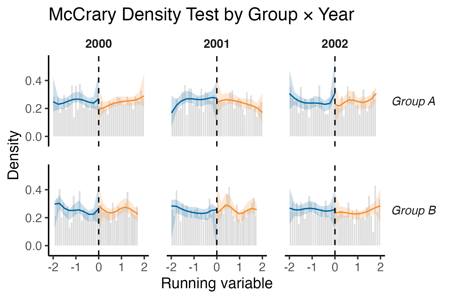
Much better!
In conclusion, this is not meant to be a dig on patchwork, it’s fantastic for combining different plots, but less suited for “fake faceting” like this. By extracting the underlying ggplot data from rdplotdensity, we can facet, style, and annotate however we want. This trick should work not just for rdplotdensity objects, but for many other functions that return prebuilt ggplot objects.